

COLOR THEORY CLASS: USING COLORS TO EVOKE EMOTIONS WITH BAG DESIGNS
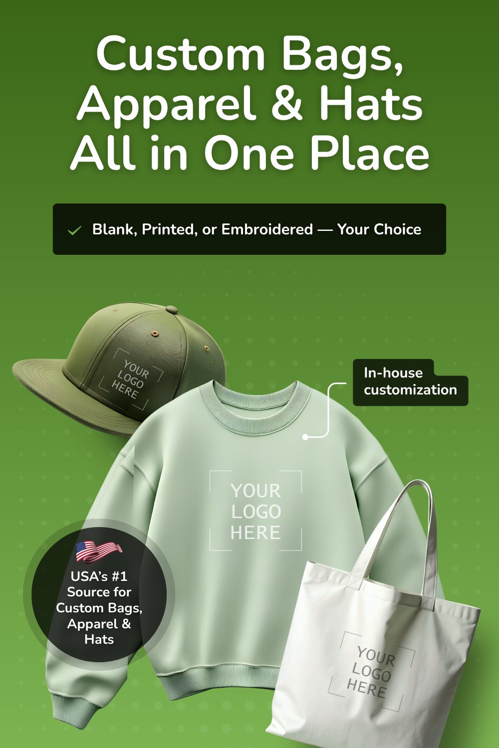
Whether you're shopping for blank bags, premium apparel, stylish hats, bulk quantities, or fully customized printing and embroidery, BagzDepot delivers fast, affordable, and high-quality solutions — trusted by 200,000+ customers nationwide.
Request a Custom Quote →
Did you know that blue is the most popular color worldwide?
Now, we're not saying you have to make every bag you design blue. However, it doesn't hurt to know a bit about color theory and trends when designing merchandise!
Did you know that blue is the most popular color worldwide?
Now, we're not saying you have to make every bag you design blue. However, it doesn't hurt to know a bit about color theory and trends when designing merchandise!
Color theory can be intimidating, especially if you're new to the psychology field. Luckily, it's easy to cover the basics and get designing with the perfect colors!
We've got you covered! Keep reading below for a quick color theory class to help you ace your next merch design session!
Color Theory Class on Warm Colors
Warm colors are often used to create an inviting atmosphere and to supply comforting energy. Warm colors can also lead to hunger, which is why you'll often see them used in restaurants (i.e. McDonald's and Wendy's).
Red
If you want an attention-grabbing color for your next bag design, consider red. Red elicits emotions like passion and energy. If you're designing a gym bag, red is the perfect color because it spurs on action.
Be careful with your use of red though. It can be a very dominating color, and it can also be perceived as a warning color.
Orange
Orange is a good color choice for bags geared towards children. Orange retains some of the intense passion of red, but it's a bit more muted. Because of this, it has a more playful quality.
If you're making bags for a teambuilding event, orange is a solid choice. Orange elicits enthusiasm and energy, which is exactly the kind of environment you want to create at a teambuilding event.
Pink
Pink is a color often associated with feminity, but it also is a color that is associated with compassion. Pink is a little less extreme than some of the other warmer colors, but it still packs a punch in the right shade.
Pink is considered to be a soothing and somewhat youthful color. It's a wise color choice if you're designing a bag geared toward empathic young adults.
Yellow
Yellow is a great color to use in bag design if you are searching for an extremely positive and uplifting color. Yellow is the most visible color, so it's great for grabbing attention.
Be mindful of how you use yellow though because it can cause visual fatigue. It's wise to use a toned-down shade of yellow or to only use it as an accent color.
Evoking Emotions with Cool Colors
Cool colors are typically regarded as creating a more peaceful environment. They're also great for stimulating creativity!
There's actually quite a bit of concrete science that goes into a color theory class. For example, cool colors create less strain on the eyes, which is likely part of why they have a calming effect.
Blue
Blue is the shade perhaps most associated with tranquility. However, blue can also represent sadness, so be mindful of how you use it.
Blue is considered the least "appetizing" color, which makes it the perfect choice if you're designing bags for a branded weight-loss campaign.
Green
Green is most associated with nature and growth. If you're designing bags with an eco-friendly edge or for outdoor use, green should be your go-to color.
Purple
Purple is most closely associated with royalty and wealth. If you are looking to create merchandise or bags that have a regal feel, purple is a great color choice.
Purple is also considered a mysterious color. If you have an elusive brand and want to convey that through your bag design, a rich purple is the ticket.
Finding Your Fit
Choosing a color for your next bag design can be challenging, but it's not impossible! With the info from the condensed color theory class above, you'll have no trouble creating your next winning bag design!
For more articles like this, check out the rest of our website!
Description
Promotional Bags Tips & Resources
-

Canvas vs. Cotton vs. Non-Woven Bags: Which Is Best for Your Custom Branding Project?
Jun 08, 2026If you're sourcing custom bags for resale, giveaways, or brand merchandise, the first question isn't
Description
-

Tote Bag Trends 2026–2027: What's Hot, What's Sustainable & What Actually Sells
Jun 08, 2026In the year 2026–2027, totes are no longer just a simple option for carrying groceries; they are now
Description
-

Bridesmaid Tote Bags Bulk Custom: DIY Wedding Welcome Bags on a Budget
Apr 16, 2026Want to add a personal, heartfelt touch to your wedding without overspending? DIY tote bags might ju
Description
- Read more articles