

HOW TO USE GRAPHIC DESIGN TYPOGRAPHY TO CREATE EYE-CATCHING PROMO BAGS
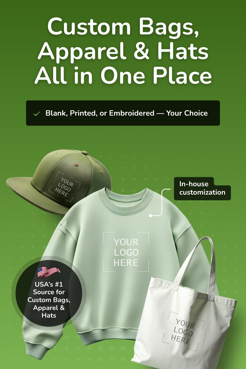
Whether you're shopping for blank bags, premium apparel, stylish hats, bulk quantities, or fully customized printing and embroidery, BagzDepot delivers fast, affordable, and high-quality solutions — trusted by 200,000+ customers nationwide.
Request a Custom Quote →
If you're creating promo bags, you need crisp and memorable designs. Knowing a few things about graphic design typography can elevate your bags above the rest. But how should you get started?
If you're creating promo bags, you need crisp and memorable designs. Knowing a few things about graphic design typography can elevate your bags above the rest. But how should you get started?
Keep reading to learn how you can use typography to your advantage to create eye-catching bags!
Graphic Design Typography Should Communicate Your Message Clearly
Whether you're printing on small make-up pouches or bigger canvas tote bags, you want to choose typography that is readable and clear. It's good to be clever and original with your designs, but ultimately you want to get your point across.
When you arrange typography, make sure that any overlapped letters don't confuse the message. Most designers would say that it's a good idea to minimize the spacing between letters and lines of text for a more compressed shape, but don't overdo it at the expense of clarity. When in doubt, keep it simple.
Know About Serif vs. Sans-serif
You've probably heard about serif and sans-serif fonts, but do you know what they mean? You can think of serif fonts as being those with ornamentation on the edges of each vertical, horizontal, or diagonal stroke. Sans-serif fonts are cleaner and have no ornamentation, like Helvetica.
Serif fonts can suggest an older or more classic vibe, while sans-serif fonts can look cleaner and more modern. If you can build some awareness of the lingo of typography, you'll set yourself up for knowing how to pull these fonts together into better designs.
Aim For Varied Typefaces
How do you combine everything into the perfect design? If using digital typography in a graphics program on your computer, consult a typography guide to learn the best practices of mixing and matching fonts.
Many designers suggest aiming for variety. In other words, don't just use a handwritten script. Pair it with a sans-serif font for more balance when the design is printed on your bags.
Also, play with scale. If there is a particular word in your design that matters more than the rest, scale it up so that it stands out more.
Don't Forget About Color
Understanding the basics of color theory is another important component of the design process. The last thing you want is to choose a color that doesn't stand out against your bag. You could have the greatest design in the world, but nobody will see it.
Aim to use complementary colors if you're going for a dynamic, bold aesthetic. If you want something subdued, choose colors that are neighbors on the color wheel, like blue and green. Think about what kind of tone you want to communicate and plan your color choices accordingly!
Start Designing
When working with graphic design typography, take the time to test out a few options before committing to the right one. Show trusted friends your ideas and make edits before you print dozens — or hundreds — of bags. You'll be happier with your products if you invest the time upfront!
When you're ready to get started, check with us to find the perfect bags for the job!
Description
Promotional Bags Tips & Resources
-
")
How to Choose the Right Printing Method for Your Custom Bags (Screen Print vs DTF vs Embroidery)
Feb 20, 2026When ordering custom tote bags, backpacks, or promotional bags, one of the most important decisions
Description
-

Cotton Bags With Your Logo Printed: The Smart, Eco-Friendly Way to Promote Your Brand
Feb 04, 2026Looking for a practical promo item people actually keep and reuse? Cotton bags with logo printing a
Description
-

Conference Bags, Apparel & Hats With Your Logo: A Complete Branding Guide for Events
Jan 29, 2026Planning a conference, convention, or trade show? The right branded swag can turn attendees into wa
Description
- Read more articles